Functionality For Your Buttons
bootstrap/3.3.6/css/bootstrap.min.css">
<link rel="stylesheet" href="//maxcdn.bootstrapcdn.com/font-awesome/4.5.0/css/font-awesome.min.css">
It's all very well knowing how to get nice looking buttons, but now what? A button needs a reason for being, it has to fulfill some purpose. So let's look at some of the ways you can use buttons on your site.
First, how about we connect them to Social media Pages?
|
|
I have only linked one of these buttons (that is enough to demonstrate the example). the center button will open a new tab to the Pinterest website. But I haven't used a link in the standard way. if you hover over the button, while the pointer changes to indicate a link, there is no URL showing in the bottom of the browser. I used a small bit of javascript in the button tag.
<button class="btn btn-danger btn-block" onclick="window.open ('http://www.pinterest.com')">
<i class="fa fa-pinterest-square fa-2x"> </i>
My Pinterest Boards
</button>
If I wanted the URL to open in the same window... perhaps a new page on my site, the javascript would be slightly different.
onclick="window.location.href='some-page-name.html'"
Bootstrap give far more choices and options with buttons than I can cover here. There are tutorials all over the internet to teach you more about how to use them. For example, I haven't even looked at the various sizes that are available to you.
The classes that control the button size get added to the button tag, and the sizes are...
btn-lg btn-med btn-sm btn-xs
From large to extra small, not so hard is it? I haven't used those classes on these examples, I have just let the container and button text determine the size
When To Use A Button And When To Use A Link
Once you know how to create nice fancy buttons, you might get the urge to use them everywhere. After all, a button can do the same thing as a link... click it and go somewhere. But IMO there is a major difference between the two. And I'm not sure everyone "gets" what that difference is.
A link is used to go somewhere, a button is used to do something.
yes, I know I have broken my own rules here on these bootstrap pages, but that was really just to demonstrate how they worked. Remember, a link can be styled to look like a button, and a button can be styled to look like a link, and they can both do similar jobs, but they are really two different beasts. So I repeat...
A link is used to go somewhere, a button is used to do something.
On the flip side, Socia Media buttons are an exception. People are used to seeing these as icon buttons so I'm always going to try to use what people expect to see. But in general, I use links to go somewhere. And buttons to perform an action.
Now that we have that cleared up, let's look at some more uses for buttons, uses that do something rather than just go somewhere.
Buttons and Forms

Forms are really where buttons shine. People KNOW when they see that big blue button with a send icon on it, that when they click it something is going to happen. A link just doesn't give people that visual prompt. There are 3 main submit buttons in use by SBIers. C2, Contact and Signups . And they all use buttons, so maybe we should look at styling some of them? The newsletter signup first, as that is fairly simple and straight forward to do.
As I don't have a newsletter signup for this website, I am going to use the one from my Roses website. You can see it here on the page, and it is taken straight from my website. What we are going to do, is put the twitter form code on the page, and then add in the things from our own form that we need to get it working properly. And, we need to add a lot less than you might think!
With any luck, we might end up with something that is a little more enticing, and definitely more professional looking. To do the same with your newsletter, just grab the source code for it from any page where you have it displayed, and follow along.
Creating a Horizontal Signup
First, look at the relevant part of my signup form, the bit that has the form fields and submit button. The bits I will need are in red.
<form action="http://www.love-of-roses.com/cgi-bin/mailout/mailmgr.cgi" method="post">
<input type="hidden" name="list_id" value="8731">
<input type="hidden" name="action" value="subscribe">
<b>Email</b><br><input name="email" type="text" size="15"><br>
<b>Name</b><br>
<input name="name" type="text" size="15"><br><font size="1"><b>Then</b><br>
<input type="SUBMIT" value="Subscribe to World of Roses" name="SUBMIT"><br>
</font>
</form>
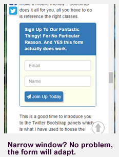
Twitter Bootstrap has all the classes we need to create a horizontal form like the one below. All we have to do is use them!
Not only does this horizontal form look nice, it is totally responsive. On a phone, the form fields go to full width one above the other, try reducing your browser window to check that out. This might be useful either at the very top or bottom of a page, or even in the footer area. You can even put it into a side column and it will adapt nicely to the width of that. No need for you to figure out how to get a form looking great, or how to make it mobile friendly... Bootstrap does it all for you, all you have to do is reference the right classes.
This is a good time to introduce you to the Twitter Bootstrap panels which is what I have used to house the signup form above. So the most basic is this...
<div class="panel panel-primary">
<div class="panel-heading">This is my panel heading</div>
<div class="panel-body">This is whatever content I want in the panel</div>
</div>
That will produce a panel like the one below.
The color can be changed, see how the word primary is the same as we used for our buttons?? yes, we have the same choices for our panel headings as well. So panel-warning will give us a red top section. panel-success will give us a green top section. Note the colors are more washed out than the buttons, and text is changed to compliment the panel color.
I bet you have seen these types of panels everywhere on the internet, and perhaps you have wondered how they got them? Well, now you know!
So now for our form that I placed inside my panel, Here is the code that provides the form, you just have to add your own details. The parts where you need your own details from your signup are in red. The two lines in blue are optional, to hide the labels. If you wish to have the filed labels displayed, then just delete those.
Just copy and paste the whole thing into your page (into a bootstrap panel if you like!) and then change the details.
<form class="form-inline" form action="http://www.love-of-roses.com/cgi-bin/mailout/mailmgr.cgi" method="post">
<div class="form-group">
<input type="hidden" name="list_id" value="8731">
<input type="hidden" name="action" value="subscribe">
<label class="sr-only" for="inputEmail">Email</label>
<input type="text" name="email" class="form-control" placeholder="Email">
</div>
<div class="form-group">
<label class="sr-only" for="inputPassword">Password</label>
<input type="text"name="name" class="form-control" placeholder="Name">
</div>
<button type="submit" name="SUBMIT" class="btn btn-primary">
<i class="fa fa-paper-plane 2x"></i>
Join Up Today
</button>
</form>
So there you have it. A way to create and style nice looking buttons, add professional looking icons to them, and even create slick panel boxes and forms, all with minimal work and effort. In fact apart from that (non essential) onclick function I added to my button links, we didn't even use any javascript, just referenced a few classes from the twitter and Font Awesome CDNs.
I hope this has given you some ideas as to ways that you can use Twitter Bootstrap CSS, and the Font Awesome icons. One example would be to add the magnifying glass icon to your search bar.
So... who said Bootstrap was hard? if you enjoyed this bootstrap tutorial please do let me know. I'm working on some other examples, such as printing (which can be an issue with mobile devices!) so do please visit again to check up on what's new.

Comments
Have your say about what you just read! Leave me a comment in the box below.