How To Get This Slim Header Template
AIM: Maximum design flexibility for the minimum amount of code possible.
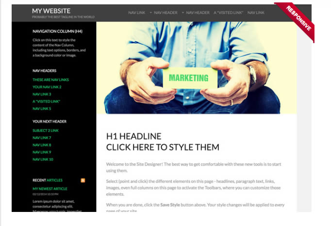
I used the same template Wendy has on Diva-Girls-Parties-And -Stuff.com. It is in the Marketing section and is the one with a big pic above the content of a man sitting down holding a sign in front of him. You chose well Wendy, I haven't found a template yet that is easier to work with or more flexible with minimal css.
The template doesn't work this way out of the box, but we can add just a few lines of css to get it into a state that will make it easily adaptable to almost any situation where you require a fullwidth slimline header background. It's just a few lines of custom css that can get pasted into the template once it has been selected, and then it can be customized in Site Designer as per usual.
We want to remove the black nav column background in the default template, to allow the body background to be editable (can't do either with default template), to set the height and color of the top and bottom black stripes: you only need a few lines of css added to the custom css in Site Designer....
#PageWrapper{background-color:transparent;}
#HeaderWrapper {background:#000;height:58px;}
#Header {width:100%; max-width:1150px;}
#FooterWrapper {background-color:#000;}
#ColumnsWrapper {background:url()#fff; width:100%; max-width:1150px;}
#ContentColumn .Liner {padding:0 5%; background:url(); border-top:transparent;}
That will give you the flexibility you need. Only a few lines, and it's easy to see how to adapt those. For example, if you wanted a green strip that was a bit thicker at the top, you would change the HeaderWrapper color to green and increase the height to whatever you wanted. Same thing with the FooterWrapper.
So to get that basic setup, it's only 3 steps.
- Select the correct template from the Gallery
- Remove that big pic from the top of the content column
- Add those 5 lines of custom css
Explanation of what each line of css does
#PageWrapper{background-color:transparent;}
The PageWrapper has some color in it so this is removed by using transparent value. We can now set body background to a color oor image and it will show
#HeaderWrapper {background:#000;height:58px;}
This is the strip along the top, which stretches fullwidth. We can change color and height.
#Header {width:100%; max-width:1150px;}
Because increasing the ColumnsWrapper to 1150px doesn't increase the header width, we need to do that here. If you are leaving the template at the default 1000px width you do NOT need to add this line of css.
#FooterWrapper {background-color:#000; height:auto;}
Same as the header, except we don't set a height...it will automatically adapt to the height of whatever is in the footer
#ColumnsWrapper {background:url()#fff; width:100%; max-width:1150px;}
As pagewrapper is now transparent, we need to add our BG color to the content area. I have also increased the width from the standard 1000px to 1150 (optional). While width is increased, it will still shrink down to accommodate narrower windows such as 1024px wide monitors.
#ContentColumn .Liner {padding:0 5%; background:url(); border-top:transparent;}
The default for this had big padding to stop the big BG image (man holding sign) being covered. The image is removed, and padding reset to remove that big gap at trhe top of the content. Also, there was a dark border line that has now been set to transparent.
But this can be taken further with improving the nav with just a few more lines and a custom image for the menu button (optional).
Improving the Menu Button
This part is if you are happy with the way that the menu button doesn't show in that 480-768px width range (when using a LEFT vertical nav, it will show when using a top drop down).
If you wish to replace the MENU button with a hamburger icon (which is pretty standard on most mobile friendly sites) then all you need is your own custom background image for the button and a couple of lines of css. For my images, I used transparent PNG images. A small logo placed into the header area as the header image, and 3 white lines for the hamburger image on the menu button.
I went and selected the menu button using mobile views (both portrait and landscape) and uploaded the hamburger image. I searched long and hard to find some way in SD to get rid of the word MENU but couldn't find a way.
That is because you do NOT remove the text in SD, you have to do it in Block Builder, when you add a navigation to a page. So when you do that, look in the toolbar and you will see where you can chamge the word MENU.But you can't delete it... you can try but it will keep coming back so only way is to make the text trasparent.
Adjusting Mobile Break Points
The break points (where layouts change for tablets and mobiles) can be adjusted, so that the menu button will appear at 768px instead of at 480px. IMO this is better than the default 480px, as it's not intuitive for people to scroll down below the content to find your navigation.
This is assuming you are using a left nav. If you are using a top drop down, then you have no problems and can ignore the following css, you don't need it.
- Put left nav into a container set to show in desktop only
- Put the same nav in the top of header dot and have that in a mobile only container
Add the following css to Site Designer.
@media only screen and (max-width: 768px) {
.desktopOnly {display: none !important;}
.mobileOnly {display: block !important;}
.ResponsiveNavWrapper .ResponsiveNavButton {color:transparent !important;}
}
What that does, is hide the left nav when template reduces to 768px or less, and shows the top menu button and mobile nav at that point as well. Far more user friendly than the default functionality, which is to drop the left nav to below the content with no way to know it's down there, other than scrolling.
The last line is to make the word MENU transparent on the button, as I'm using the hamburger background.
If you really don't want to do it this way (perhaps worried that duplicating the nav is an issue, though I don't believe it would be), then there is another way to do it.
Keep the left nav in a normal container (show all devices) don't use a top nav, and just put a link to the left nav in the below header or above H1 dot that goes down to the vertical navigation (put that link in a mobile only container of course).
This would have the advantage of freeing up the top strip to place a few links or social icons or whatever up in that space.
Want Extra Column on the Right?
This is easier than you might suppose, it is only 2 lines of extra css added to the first block I gave at the top of this demo page (the next page will show how it looks, check the link at the bottom of this page to go there). The extra 2 lines are...
#ContentColumn {width: 75%;float: left;}
#NavColumn {width: 25%;float: right;}
The only thing I did was change the floats from left to right (and vice versa for the other column) and it all behaves perfectly. You can even change the widths , just make them add up to 100%. For a wider extra column, maybe try 70% and 30%.
Some of the things I changed in Site Designer
All basic SD sort of changes really, but here is some of what I changed to compliment the revised template.
- As the black bg was removed from the nav column, I changed the column headings from white to black
- I removed some of the bottom and all of the left padding from the footer to cater for my own preferences.
- Removed the MENU text from the mobile nav button
- Adjusted the massive H1 size, far to big for my taste, especially in mobile view.
- I changed color of top nav links and background to match the black top strip.
- I set the background of the content and nav columns to white.
- Set the body background color to light grey, just to show that it can be done, unlike the default template setup.
This template is left nav column and right content column by default. However, it is only 2 lines of very simple css to change it to the other way around, with content on the left, nav column on the right. The instructions given are for the template in its default state (nav column on the left). However, 2 lines of code can change that and the instructions are given on the next page.
HOW TO SWAP COLUMNS SO NAV IS ON THE RIGHT AND CONTENT IS ON THE LEFT

Happy Sitesell Pro Customers
Hi AJ,
You did a fantastic job and we are very happy with your work!! We are very appreciative of the extra mile you took to make sure everything will be easier for next year!
Thanks for all of your hard work!!! It is such a pleasure working with you!
Laura
Hi AJ,
Massive thanks for all your work, I'm really happy with it. Thanks for your advice as well, adding an include to the header shouldn't be too hard and I'll watch out for those header and body tags in includes.
Thanks again and all the best.
Stuart
Recent Articles
-
Javascript or jQuery
Apr 23, 17 09:06 PM
Javascript or jQuery. Is one better to learn than the other? If so, which, and why? -
Print Page Section With Javascript
Apr 23, 17 07:26 AM
Print Page Section With Javascript, choose to print only one div from page content. -
Font Size Buttons With jQuery
Apr 09, 17 10:39 PM
Copy and paste code for font size Buttons With jQuery -
Hide form with jQuery
Apr 09, 17 07:56 PM
Here is a simple way to hide a contact form, and display it with the click of a button -
Easy jQuery scripts
Apr 09, 17 03:22 PM
Easy jQuery scripts that you can copy and paste into your webpages without knowing how to code.
Comments
Have your say about what you just read! Leave me a comment in the box below.