Mobile First, What does that even mean?
Think about the way most of us tend to design a responsive website. We start off with the full sized "desktop version" and then we begin to add media queries to shuffle content and layouts as screen sizes reduce. But is that the best way? The answer is a bit more complex than just a YES or NO. But read on so you can draw your own conclusions as to the merits of mobile first.
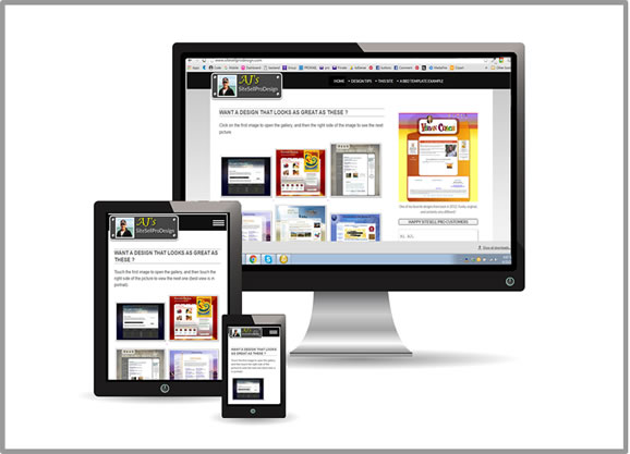 Responsive design: the same HTML on the page but using CSS to alter the display for different devices
Defining Desktop First, or "Graceful DEGRADATION"
Let's examine at how a typical style-sheet for this style of designing might look (and that includes this website)
/*********Main style rules************/
500 -1000 lines of CSS, setting up a pixel perfect design for desktop/laptops. This includes loading all the required background images for the desktop design
/********Now for some tablet sized screens ********/
@media screen and (max-width:768px){
Another 100 lines of CSS that sets up the layouts for a tablet screen, and probably hides some things that we had on the desktop
}
/*****Now we need to consider mid phone sizes*****/
@media screen and (max-width:480px){
More CSS to cater for the mid phone sizes (or small phones in landscape orientation)
}
/****** And what about the smaller phones? ******/
@media screen and (max-width:320px){
We can't forget about things like the iPhone 4 or those cheap Androids that use a 320 x 480px sceeen, so let's add some CSS just for them
}
Remember, CSS loads and works from the top down. So that poor little iPhone 4 has a heck of a lot of CSS to load, a lot of style rules that it simply doesn't need, and background images that will never be displayed, all to get to the part that applies the styling for it.
So that is inefficient to say the least. And there is no doubt that the website performance on smaller phones will suffer as a result. BUT... probably not enough on the majority of websites to be concerned about. However, there is a lot of CSS being loaded and executed that doesn't need to be, on a mobile device.
Defining Mobile First, or "Progressive Enhancement"
A birds-eye view of Mobile First.
Now let's flip our style-sheet upside down, and instead of media queries that use max-width, let's use min-width instead.
So... the first part of the style-sheet starts off with no media queries. It is created for all devices unless specified further down the style-sheet. So really, what we are doing is creating for 320px phones right from the get go.
Our little iPhone 4 now only loads and executes the bit that applies to it, rather than all the rest of the stying that doesn't. It doesn't load (and then not display) that big 80kb body background that you might have for laptops. Result: a faster loading mobile design.
Further down the style-sheet, we then add in media queries for phones that are 480px and larger. This might be almost identical to the previous section, with the addition of anything that needs to be changed or added for the wider screen.
We then carry on adding min-width queries, until we arrive at something like 1000px and above. Only then do we create the layout and styling required for these bigger displays.
While this is a simplified explanation, it should suffice to give you a general idea of the principles involved.
So Why Do We Continue To Design Desktop First?
If there are benefits to Mobile First design, why do we continue to do it the "old" way? A good question, and there is no easy answer. Some of it is perhaps down to the fact that change isn't always easy. A designer may have always done something in one particular way, and to completely change can be difficult. Also, I don't think there is much doubt that starting your design with small phones is harder to conceptualize a design than the traditional desktop first approach.
And for most people, they have little or no choice, if they are using a template (and the accompanying style-sheet) provided to them. So for now at least, I think many of us will continue with the desktop first approach. Speaking personally, I find it much easier to create the desktop design first, and then work my way down to the smaller phones. I suspect many designers feel the same way.
But that is not to say we can't do a LOT MORE to make the mobile experience better than it is now. Whether you are using BB2 or uploading your own HTML pages, there are plenty of ways to improve speed, layouts and design for mobile. Wen you consider that mobiles and tablets will account for at least 50% of traffic to a typical Solo Build It site, don't you think those viewers deserve at least equal attention? We will look at some of these ideas in a future article.

Happy Sitesell Pro Customers
Hi AJ,
You did a fantastic job and we are very happy with your work!! We are very appreciative of the extra mile you took to make sure everything will be easier for next year!
Thanks for all of your hard work!!! It is such a pleasure working with you!
Laura
Hi AJ,
Massive thanks for all your work, I'm really happy with it. Thanks for your advice as well, adding an include to the header shouldn't be too hard and I'll watch out for those header and body tags in includes.
Thanks again and all the best.
Stuart
Recent Articles
-
Javascript or jQuery
Apr 23, 17 09:06 PM
Javascript or jQuery. Is one better to learn than the other? If so, which, and why? -
Print Page Section With Javascript
Apr 23, 17 07:26 AM
Print Page Section With Javascript, choose to print only one div from page content. -
Font Size Buttons With jQuery
Apr 09, 17 10:39 PM
Copy and paste code for font size Buttons With jQuery -
Hide form with jQuery
Apr 09, 17 07:56 PM
Here is a simple way to hide a contact form, and display it with the click of a button -
Easy jQuery scripts
Apr 09, 17 03:22 PM
Easy jQuery scripts that you can copy and paste into your webpages without knowing how to code.
Comments
Have your say about what you just read! Leave me a comment in the box below.