REsponsive vs Mobilize It! Which is Better?
Before we look at the pros and cons of each method, let's get one thing clear right from the start. Either way will be much better than doing nothing! And neither way is right or wrong... both will give your mobile viewers a good experience on your website, which is really the most important thing, right?
Responsive and Mobilize It! Are Not The Same Thing
While both systems give mobile viewers an optimized webpage for their device, they go about it in different ways.
Responsive Templates use Media Queries and no scripting to do this. The Media Queries take care of the display by resizing and reformatting the html elements, using the media queries in the style-sheet, based on the width of the screen used to view the page. No changes are required on the actual HTML pages.
Mobilize It! uses javascripts to provide what would possibly be classed as dynamically served pages, but is probably more like Adaptive Design. What happens is that as the page request is made, the javascript detects what sort of device is being used. It also looks to see what type and size phone the viewer is using.
Based on that, media queries can be set in the style-sheet before the user gets it, and the page will then display an optimized version.
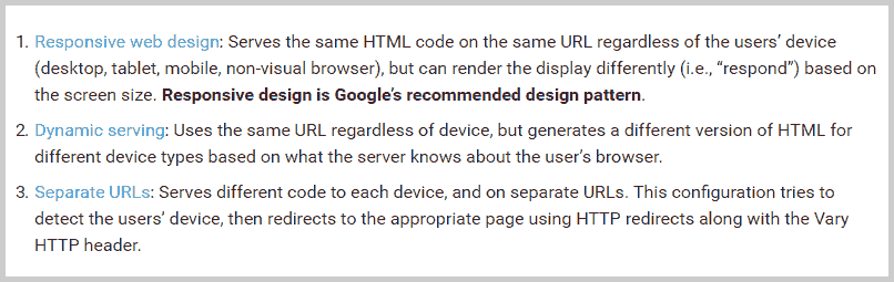
Responsive Definition
No javascripts are required for Responsive Web Design (RWD). One style-sheet is used with media queries determining what section of the style-sheet should be used by laptops/tablets/phones.
Dynamic or Adaptive Definition
The web server detects what kind of device the visitor is using, and presents a custom page (HTML and CSS) on the same URL. Typically, javascript is used, so that the browser version can be detected and css tailored specifically for that device can be served.
Choosing Responsive or Mobilize It!
Your visitors really don't care which system you use, all they care about is that the page loads quickly and has a layout that is optimized for them. And both ways will give them that. It really comes down to your personal preferences.
For me, if I was to be building a new website and was considering which to use, I would pick responsive design over Mobilize It! every time. I wouldn't be unhappy with using Mobilize It!, just I would be happier with a responsive template, and here's why.
Why I Have Chosen To Use Responsive Design
Google themselves have said responsive design is their preferred method. That alone would be enough to swing me to using a responsive template.
Windows phones do not see an optimized Mobilize It! design. I'm not sure that everyone is aware of this fact... a viewer on a Windows phone sees the same layout as desktop users. Luckily, the percentage of Windows users is pretty low on mobile, around 2-3% I believe. All the same, I prefer those 2 or 3 out of every hundred to see the design as it's meant to be viewed.
Mobilize It! handles the navigation differently. And to be honest I'm not overly fussed on having my navigation below my footer and copyright. Another drawback to this,is that the complete column for the navigation is placed down there, which means it is only 1/2 screen width and gives smaller tap targets. It is possible to write some custom CSS to address this (I can do that for you if you contact me!) and make the nav column display at full screen width with bigger and better styled links.
Responsive templates are easier to design with for a mobile device. if you use Mobilize It! then you either have to use the sandbox or an actual phone to see the exact layout and functionality. Emulators such as the Google Chrome Developers tools are useful, but it's not as quick and easy as just reducing a browser window to trigger mobile layout, like you can do with a responsive template
Having said all that, there is one advantage to Mobilize It! that I should mention. At the top of the page there are 2 buttons, one for the jump down to the navigation, and the other to view the full site. Out of the box, the SBI responsive templates don't have any way for mobile viewers to view the full desktop layout, if they wish to do so.
Although to be fair, not many will want to do that. And it is probably something that could be added by using a style-sheet switcher button. But I have never felt the need to add that myself, the take up rate for it would be very low for most sites (unless you have a lot of content that simply doesn't look good on a mobile).
Conclusion
All things being equal, I would choose responsive templates over Mobilize It! However, the advantages are not so great that I would go to the trouble with changing over if I already had Mobilize It! on my site and working well. They both give the user what they want... an optimized webpage for their device. And that is all that matters, in the long run.

Happy Sitesell Pro Customers
Hi AJ,
You did a fantastic job and we are very happy with your work!! We are very appreciative of the extra mile you took to make sure everything will be easier for next year!
Thanks for all of your hard work!!! It is such a pleasure working with you!
Laura
Hi AJ,
Massive thanks for all your work, I'm really happy with it. Thanks for your advice as well, adding an include to the header shouldn't be too hard and I'll watch out for those header and body tags in includes.
Thanks again and all the best.
Stuart
Recent Articles
-
Javascript or jQuery
Apr 23, 17 09:06 PM
Javascript or jQuery. Is one better to learn than the other? If so, which, and why? -
Print Page Section With Javascript
Apr 23, 17 07:26 AM
Print Page Section With Javascript, choose to print only one div from page content. -
Font Size Buttons With jQuery
Apr 09, 17 10:39 PM
Copy and paste code for font size Buttons With jQuery -
Hide form with jQuery
Apr 09, 17 07:56 PM
Here is a simple way to hide a contact form, and display it with the click of a button -
Easy jQuery scripts
Apr 09, 17 03:22 PM
Easy jQuery scripts that you can copy and paste into your webpages without knowing how to code.
Comments
Have your say about what you just read! Leave me a comment in the box below.