Spice Up Your Images
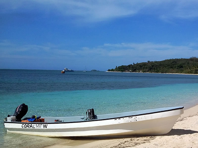
I'm going to work with just a single demo image on this page. It is from my collection of pictures taken in Fiji and the size of it is 800px by 600px with a file size of around 68kb. You might get a little sick of looking at it by the end of this page ;-) But it's quicker for your browser to download one single image file instead of a dozen different ones
So, when you put an image onto a Block Builder page, you have a few options as to styling it. You can float it left or right, you can add a border, change the color of the border, you can turn it into a link, and a few other things.
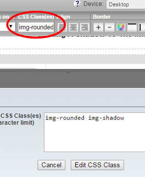
However, there are a few things you can't do, well, not with the default settings anyway. So I have created a few new classes to add to your custom css, and combined with using the container block and classes (which is such a cool addition by SBI to Block Builder!) we can expand our horizons just a little bit. So without further ado, cast you eyes over the 3 images in the responsive grid block below.
Container class name, img-rounded
Container class name, img-rounded-x2
Container class name, img-circle
The images were placed into a 3 cell responsive grid block (of course I didn't have to use a grid, I could have just placed them on the page to have full sized pictures). Each one was put into a container, and the correct class name was added to the containers. Pretty simple.
Block builder doesn't (at this time anyway) have the facility to allow beveling of corners in this way, so I felt it would be a nice addition, and simple to do... you will just copy the css at the end of the page into your Add Custom CSS in Site Designer.
Adding A Shadow To The Images
Additional class name, img-shadow
Additional class name, img-shadow
Additional class name, img-shadow
if you want a border, then just add that with Block Builder, normal rules for that apply.
Border added with Block Builder
Border added with Block Builder
Border added with block Builder
You can't add padding between the image and border using Block Builder. So if you want that "picture frame" effect, then add an extra class to the container, called pad.
Additional class name, pad
Additional class name, pad
Additional class name, pad
Floating The Image Container
Firstly, why did I put the images into containers? Because there is no other way to apply the classes to the images. We can't put classes directly into image tags while using Block Builder (not unless we manually add the images) so containers are required to add the classes.
But... the default width of a container is 100%, and while Block Builder has the means to alter the width of the container, it can't float it left or right.
That means there are 3 new classes. cont-left cont-right and cont-center I think the names describe what they do, and the floated containers will revert to being block level centered on small screens below 480px wide.
If you do want the images to remain floated even on small phones, then add -sm to the float class name. Like this... cont-left-sm That will ensure that the text still wraps around the image even on small phones.
NOTE; The image doesn't actually have to be small to do this. Because you will set the container to a width, (perhaps 50%) the picture will actually reduce in size as the screen narrows. So with our floated demo image, that might reduce down from perhaps 300px wide to less than 150px on smallest phones (and maintain aspect ratio). In other words, the pic will remain at 50% of the screen width, no matter how small that screen is. Pretty neat eh? And this is only possible due to using classes in containers.
The picture on the right. I placed my full sized image on the page, put it into a container which I changed to 50%. I then added the classes I wanted, img-shadow to give that shadow effect, and cont-right-sm to float it to the right of my content.
Wrap Up
- First, put the CSS below into the Add Custom CSS in Site designer
- Next, put a container on your page and put a picture in it
- Then decide which classes you need, and add those to the container class in the top toolbar
As example... suppose you want an image to be round, have a border and shadow, have padding between the pic and border, and be floated left. That is about as many classes as you would ever have, most images will use less than that.
You would add these 4 classes to the container (maybe consider writing down the different names until you become familiar with them)...
img-circle img-shadow pad cont-left
The following CSS gets pasted "as is" into the Add Custom CSS section of Site Designer. While it is possible to change some of the values, it should be fine as it is for the majority of people.
.img-rounded img {border:transparent; padding:0; border-radius:5px !important;}
.img-rounded-x2 img {border:transparent; padding:0; border-radius:10px!important;}
.img-circle img {border:transparent; padding:0; border-radius:50% !important;}
.img-shadow img {width:94%; padding:0;background:white;margin:6px; box-shadow: 3px 3px 5px #ccc;}
.pad img {padding:5px !important;}
.cont-left, cont-left-sm {float:left;margin-top:-5px;}
.cont-right, cont-right-sm {float:right;margin-top:-5px;}
.cont-center{margin:10px auto; display:block;}
@media only screen and (max-width: 480px) {
.cont-left {display:block; float:none;margin:0 auto 0 auto;}
.cont-right {display:block;float:none;margin:0 auto 0 auto;}
}

.img-rounded
Gives a 5px border-radius to the image
.img-rounded-x2
Gives a 10px border-radius
.img-circle
uses border-radius of 50% for circular effect
.img-shadow
puts light grey drop shadow on the image
.pad
Adds 5 px padding around the image
.cont-left and .cont-right
Floats container to the left or right, and will change to block level centered on smaller phones
.cont-left-sm and .cont-right-sm
Image will remain floated and reduce in size relative to the viewport.
Comments
Have your say about what you just read! Leave me a comment in the box below.